
The Dashboard provides a territory-wide summary of the five-day outage forecast. It is the primary starting point for daily storm monitoring and pre-event resource planning.
To access the Dashboard, select the Dashboard icon from the left navigation bar.
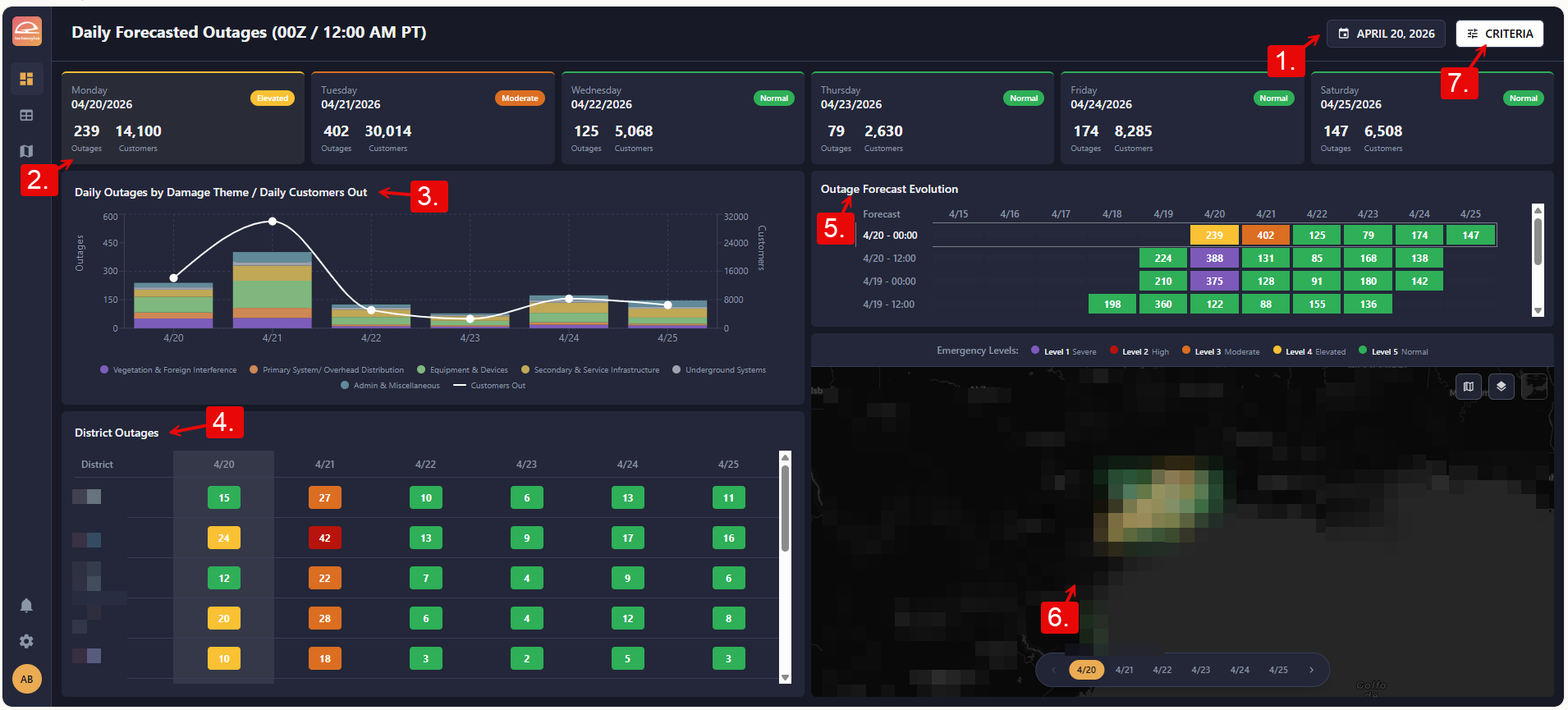
1. Forecast Date
The date displayed in the upper-right controls which forecast run is shown across all Dashboard components. By default, the Dashboard opens to the most recent available forecast.
To change the forecast date, select the date field and choose a date from the calendar.
2. Day Cards
The row of day cards across the top of the Dashboard summarizes the territory-wide forecasted outage count for each of the next five days. Each card displays the forecast date, the total predicted outage and impacted customer count, and a color indicator reflecting severity from Level 1 (Severe) to Level 5 (Normal).
Select a day card to highlight that day's forecast in the district table and map below.
3. Outage Chart
The outage chart displays the forecasted outage count over the five-day window as a time series. Outages are broken out by damage theme (such as Vegetation & Foreign Interference or Equipment & Devices). The x-axis displays the date while the bar chart indicates the number of outages by type as measured by the left y-axis. The line graph indicates the number of customers impacted as shown by the right y-axis.
4. District Table
The district table lists each service center in your territory with its forecasted outage count for the selected day. The table is color-coded by Emergency Level from Level 1 (Severe) to Level 5 (Normal).
Select any District name to navigate to that District Detail Panel.
5. Forecast Evolution Chart
The forecast evolution chart shows how the outage prediction for each day has changed across successive forecast runs as the event has approached. This view helps you assess forecast confidence and identify situations where predictions are shifting significantly. The table is color-coded by Emergency Level from Level 1 (Severe) to Level 5 (Normal).
6. Dashboard Map
The map panel provides a geographic view of forecasted outage counts across your service territory for the selected day. Districts display outage counts and are color-coded by Emergency Level from Level 1 (Severe) to Level 5 (Normal).
Select any District on the map to navigate to view details or click View on Main Map.
Use the map controls in the top right of the map to update the map display:
-
Legend: Toggle the map legend on or off.
-
Reference Layers: Open the Layer Manager to control which reference layers are displayed on the map.
-
Basemap: Select the base map style (Imagery Hybrid, Light Grey Canvas, Dark Grey Canvas, Streets, or Terrain).
7. Criteria
Select Criteria to adjust the thresholds and display settings that govern how the forecast is visualized across the Dashboard and Map. Criteria settings are persistent across your session.