Layer Visualization Options
To access the Layer Visualization panel, click the three dots options menu (⋮) next to any layer and select Layer Visualization:
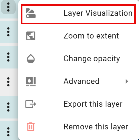
Not all data layers have the same options, so the dropdown may display fewer options depending on the layer selected.
The Layer Visualization panel is a comprehensive styling interface that allows users to customize the visual appearance of each data layer.
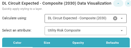
Options include:
-
Calculate using dropdown to select the dataset (e.g. circuit or segment)
-
Select an attribute dropdown to select the desired attribute/metric
-
Styling Options (tabs):
Styling By Color
Color Options
A variety of color gradients are available to choose from.
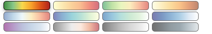
The choice of color gradient significantly impacts how effectively the data communicates risk, patterns, and insights.
Green-Yellow-Red (Traffic Light)
Best for: Risk assessment, urgency indicators, performance metrics
This is the most intuitive gradient for risk visualization because it leverages universal color associations:
-
Green = Safe, low risk, good
-
Yellow = Caution, moderate risk, warning
-
Red = Danger, high risk, critical
Use when: Visualizing wildfire risk, circuit overload probability, safety scores, or any metric where the intent is to invoke an immediate understanding of "good vs. bad." This is likely the default choice for utility risk composites because stakeholders can instantly identify high-risk areas.
Practical Tips for FireSight
-
Consistency is key: Use the same color scheme for the same type of metric across different layers
-
Consider colorblind users: Red-green combinations in particular can be problematic for some users
-
Layering strategy: Use complementary color schemes when overlaying multiple layers (e.g., red for risk and blue for infrastructure)
-
Context matters: Consider the audience of the map (for example, public-facing maps may need softer colors than internal operational dashboards)
For wildfire risk analysis, the green-yellow-red gradient remains the gold standard because it requires no explanation—everyone immediately understands that red means high risk and requires attention.
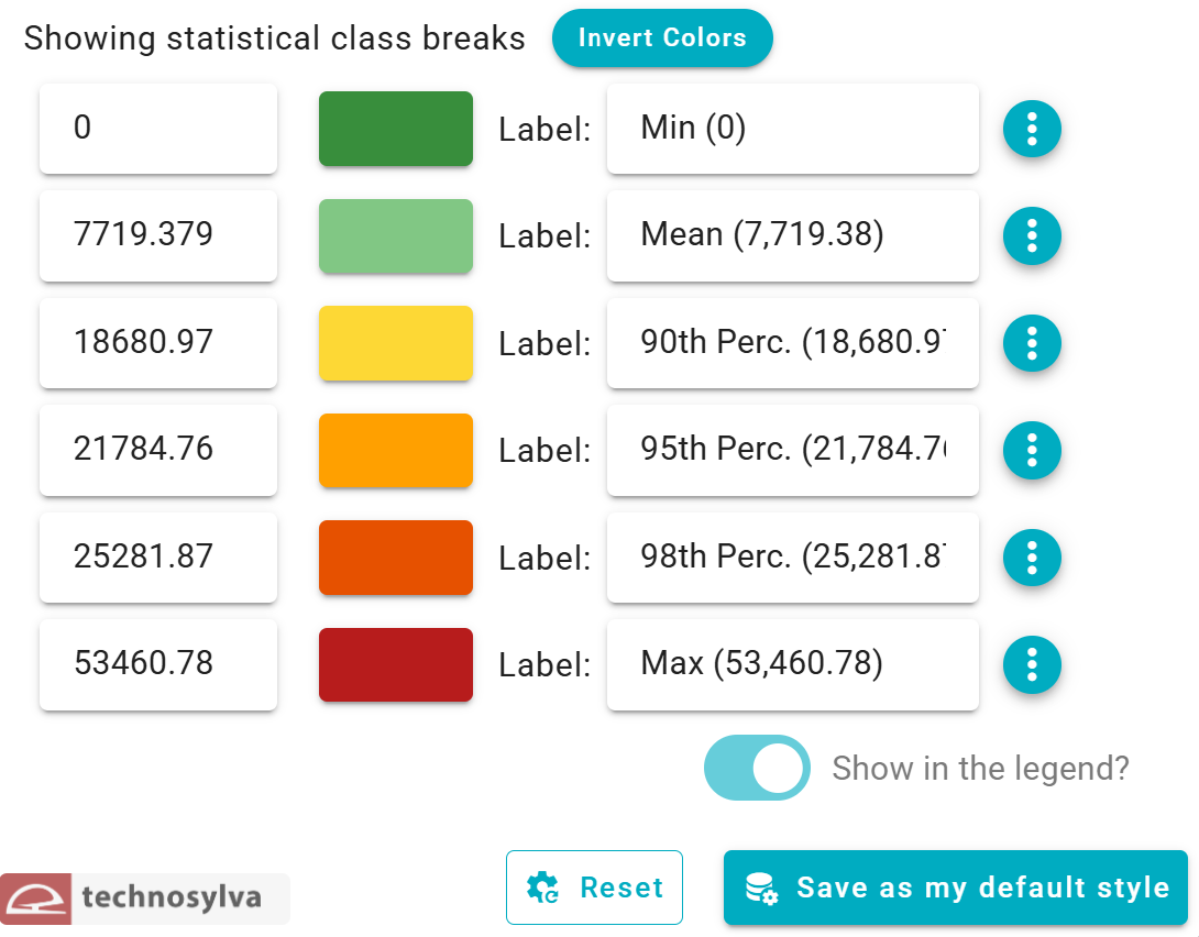
Class Break Options
The classification method selected fundamentally changes the story the data tells. Two maps of identical data can look completely different and lead to opposite conclusions depending on the classification technique. For example, a viewer of a risk map will assume:
-
Red areas = high risk (top category)
-
Green areas = low risk (bottom category)
-
Equal visual weight = equal importance
However, the classification method determines what qualifies as "high" or "low," which can dramatically alter decision-making.
Stats
Styling by Color defaults to the Stats classification method.
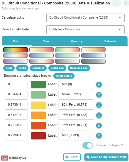
This method uses statistical measures to create class breaks based on key statistical values:
-
Minimum value
-
Mean (average)
-
Selected percentiles (90th, 95th, 98th)
-
Maximum value
This approach highlights data distribution relative to statistical benchmarks, making it easy to identify values that fall into specific statistical categories (like "above the 95th percentile"). It's particularly useful for emphasizing outliers or specific risk thresholds.
Viewer perception:
-
✅ Clear risk communication: "The red areas represent the top 2% high risk location"
-
✅ Defensible decisions: "Resources were prioritized for circuits above the 95th percentile"
-
⚠️ Can minimize perception of widespread problems: If 90% of data falls below the 90th percentile, those areas all look "safe" even if they still have significant risk
-
⚠️ Sensitive to data distribution: If most values cluster near zero with a few extreme outliers, the majority of the map will appear very similar
Best for:
-
Resource allocation based on predefined risk thresholds
-
Regulatory reporting where identifying top-risk areas is required
-
Simplified dashboards where stakeholders want to see "where's the worst risk?"
Practical Tips for FireSight
In general, for risk metrics, the Stats method is often preferred because:
-
It allows the viewer to clearly identify high-risk areas using percentile thresholds (90th, 95th, 98th percentile)
-
It aligns with how organizations make decisions and allocate resources
-
It provides clear justification for and prioritization of projects in a way that is explainable to non-technical stakeholders through data (e.g. “vegetation management and system hardening can be justified for areas in the 98th percentile of population impacted even when when permits and/or funding are hard to obtain”)
-
It doesn't artificially inflate or deflate risk perception
Therefore, this is the default view when styling a layer by color.
However, the Quantiles method is recommended composite indices such as the Utility Risk Vegetation Composite and the Utility Risk Composite in FireSight. Composites have already been normalized and standardized using a quantile transformation.
The analyst should always consider the audience, purpose, and data characteristics before choosing a classification method. Regardless of the choice, the best practice is to document the classification method and break values in legends or documentation.
Additional Controls
Additional options when styling the data by color include:
-
"Invert Colors" button inverts the current color scheme with existing breaks
-
Options menu (⋮) allows individual class customization
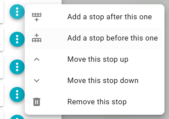
Note that at this time breaks do not recalculate when changed. Therefore, a user must adjust breaks manually when adding, moving, or removing a stop.
-
Manual editing of Values and Labels for each class.
-
"Show in the legend?" toggle allows the user to select whether to show the symbology in the legend
-
"Reset" button resets all visualization options to default style
-
"Save as my default style" button saves the current configuration as the default style for this layer
Styling By Size
This panel allows the user to control the size of features on the map based on data values, creating a visual representation where feature size corresponds to a specific attribute.
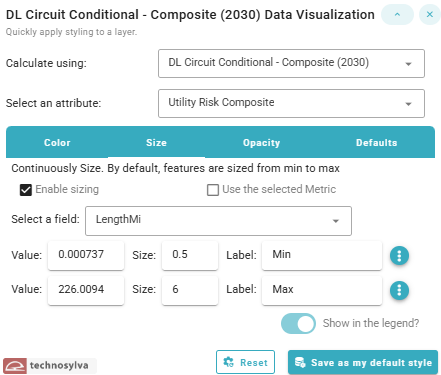
Options when styling the data by size include:
-
Calculate using dropdown to select the dataset (e.g. circuit or segment)
-
Select an attribute dropdown to select the desired attribute/metric
-
“Enable sizing” checkbox toggles whether size-based visualization is active.
-
“Use the selected Metric” checkbox
-
When enabled, the system uses the same attribute selected in the main "Select an attribute" dropdown
-
When unchecked, you can choose a different field for sizing independent of the color/classification attribute (e.g., color by risk, size by length)
-
-
Value range controls
-
By default, features are continuously sized with a minimum to maximum value
-
Options menu (⋮) - Additional settings for this break allows the user to add, move, or remove stops
-
-
The user can can manually adjust values, sizes, or labels for each value line
-
“Show in the legend?” toggle switch controls whether the size information appears in the map legend
-
Reset reverts all data visualization settings to default values
-
“Save as my default style” button saves the current configuration as the default style for this layer
Styling By Opacity
This panel allows the user to control the opacity of features on the map based on data values, creating a visual representation where feature opacity corresponds to a specific attribute.
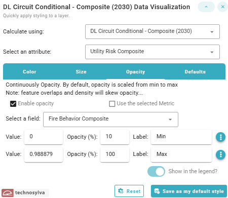
Options when styling the data by opacity include:
-
Calculate using dropdown to select the dataset (e.g. circuit or segment)
-
Select an attribute dropdown to select the desired attribute/metric
-
“Enable opacity” checkbox toggles whether opacity-based visualization is active.
-
“Use the selected Metric” checkbox
-
When enabled, the system uses the same attribute selected in the main "Select an attribute" dropdown
-
When unchecked, you can choose a different field for sizing independent of the color/classification attribute (e.g., color by risk, opacity by a second metric)
-
-
Value range controls
-
By default, features are continuously made opaque with a minimum to maximum value
-
Options menu (⋮) - Additional settings for this break allows the user to add, move, or remove stops
-
-
The user can can manually adjust values, opacity percentage, or labels for each value line
-
“Show in the legend?” toggle switch controls whether the opacity information appears in the map legend
-
Reset reverts all data visualization settings to default values
-
“Save as my default style” button saves the current configuration as the default style for this layer
Defaults
The defaults menu allows the user to apply quick styling to a layer.
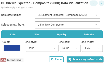
The example shown is a line layer. Polygons will have additional options.
Options when using the Defaults panel include:
-
Calculate using dropdown to select the dataset (e.g. circuit or segment)
-
Select an attribute dropdown to select the desired attribute/metric
-
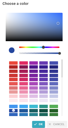
Color selector with hue and transparency options
-
Line style (e.g. solid, dash, dot)
-
Line cap (round, butt, square)
-
Line width (.3-10 scale)
-
Reset reverts all data visualization settings to default values
-
“Save as my default style” button saves the current configuration as the default style for this layer
Default styles apply only to the user, not to the organization. Currently, there is no option to set organizational defaults.